Polareis is a marketing SaaS startup that helps users plan, manage, and analyze campaigns. As part of a UI/UX Developer assessment task, I redesigned five key pages of their platform to improve the landing experience, enhance clarity, and boost conversions through consistent visuals, intuitive navigation, and reusable modular components.
The content was based on the Polareis website as of October 2025. At the time of writing, their live UI has since been updated. The redesigned pages include Home, Features, Pricing, About/Team, and Blog/Insights.

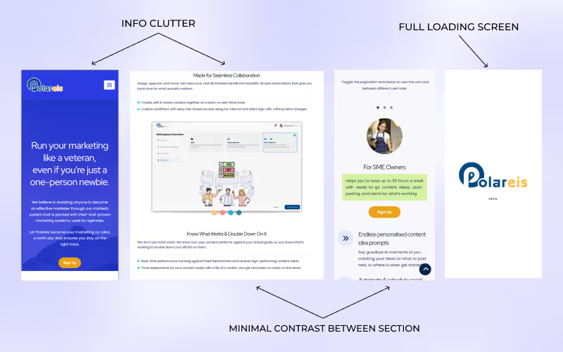
The website had strong potential but struggled with clarity and flow, leaving users unsure where to look at. Through my review, I identified a few key issues:
These issues collectively hindered the platform’s ability to deliver a clear and engaging first impression — a critical factor for conversion and user trust.
The redesign aimed to create a more focused and user-friendly website that clearly communicates the platform’s value while maintaining a modern and cohesive visual identity. My main goals were to:
To achieve these goals, I started by analyzing the information architecture and identifying content priorities. I then explored layout wireframes to balance clarity with engagement before translating them into high-fidelity mockups in Figma. The final redesign emphasizes concise messaging, accessible color contrast, and a clean visual rhythm aligned with the platform’s professional tone.
To ensure the redesign addressed both usability and aesthetic goals, I followed a structured design process that combined research, iteration, and visual refinement.
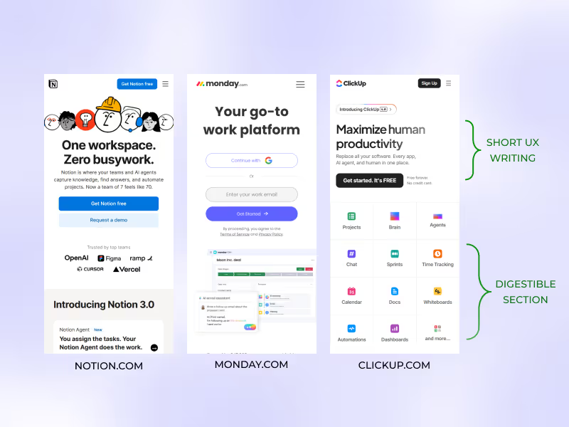
I began by reviewing the existing website’s layout and flow, identifying pain points in navigation, readability, and message hierarchy. I also explored competitor websites within the SaaS and marketing space (e.g. Notion, ClickUp, Monday.com) to understand how they communicated value and structured content effectively including the target audience to understand their needs. I found that these competitors' brands communicated complex ideas in short, digestible sections. That insight shaped how I rewrote the feature layout.

Information Architecture & Wireframing
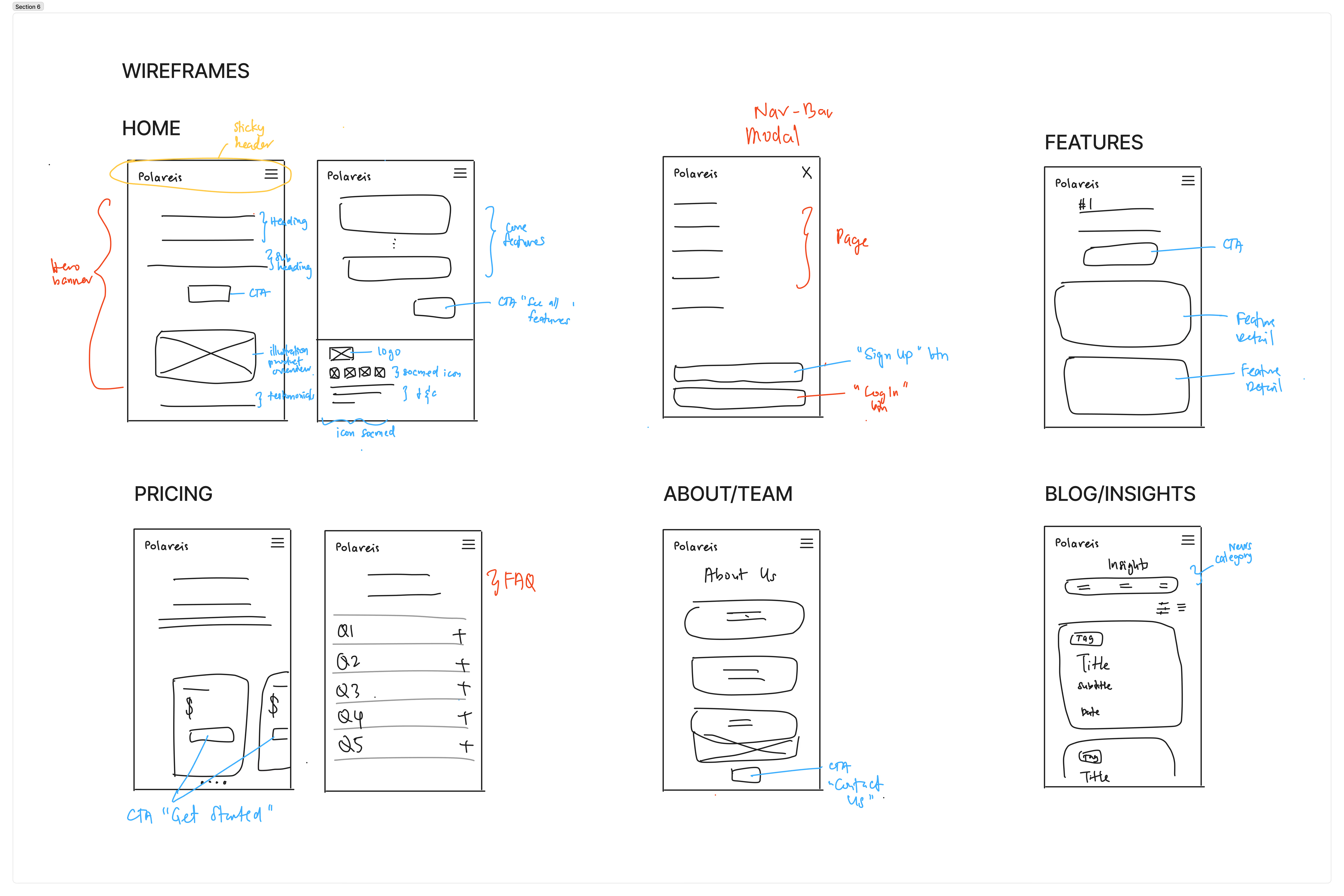
Using insights from the analysis, I reorganized the site’s information structure to create a clearer narrative — from introducing the product to showcasing its features and call-to-action. I then created low-fidelity wireframes to test content hierarchy and section placement before moving into visual design. Though, due to time constraint, I only had mobile interface sketches for the wireframes.

Visual Direction & Style Guide
I developed a consistent visual system built on a modular grid, ensuring scalability and reusability. A cohesive color palette, clear typography hierarchy, and sufficient contrast were established to enhance accessibility and brand alignment.
To guide the redesign, I established a design direction that emphasizes approachability, clarity, and confidence. The key principles include:
These principles shaped the tone and feel of the redesigned interface, ensuring that each element contributed to a cohesive, modern, and user-friendly experience.
High-Fidelity Design & Prototyping
I translated the wireframes into high-fidelity mockups in Figma, refining the design details such as spacing, visual rhythm, and imagery. Interactive prototypes were created to simulate user flow and transitions, focusing on maintaining smooth navigation and clear conversion pathways.
Throughout the redesign, I emphasized the use of reusable components for elements like buttons, cards, and navigation bars to ensure visual consistency and easier scalability for future updates.
The redesigned website offers a cleaner, more focused experience that communicates the platform’s value clearly and encourages user engagement.
The hero banner and features were simplified with concise messaging, a clear headline, and a single, prominent call-to-action. This immediately tells users what the platform does and guides them toward the next step.
By introducing consistent typography scales, balanced white space, and distinct section contrasts, the new layout makes information easier to scan and digest. Users can now navigate the page effortlessly and locate key features faster.
Reusable UI components were created for buttons, feature cards, and testimonials to maintain visual consistency and streamline future scalability. This modular approach also strengthens the brand identity across pages.
Page transitions were refined to reduce interruptions and create smoother interactions between pages, resulting in a more seamless user journey.
Stronger Visual Identity
A modernized color palette, improved contrast ratios, and structured layouts give the website a more polished and professional tone that aligns with a SaaS brand image.
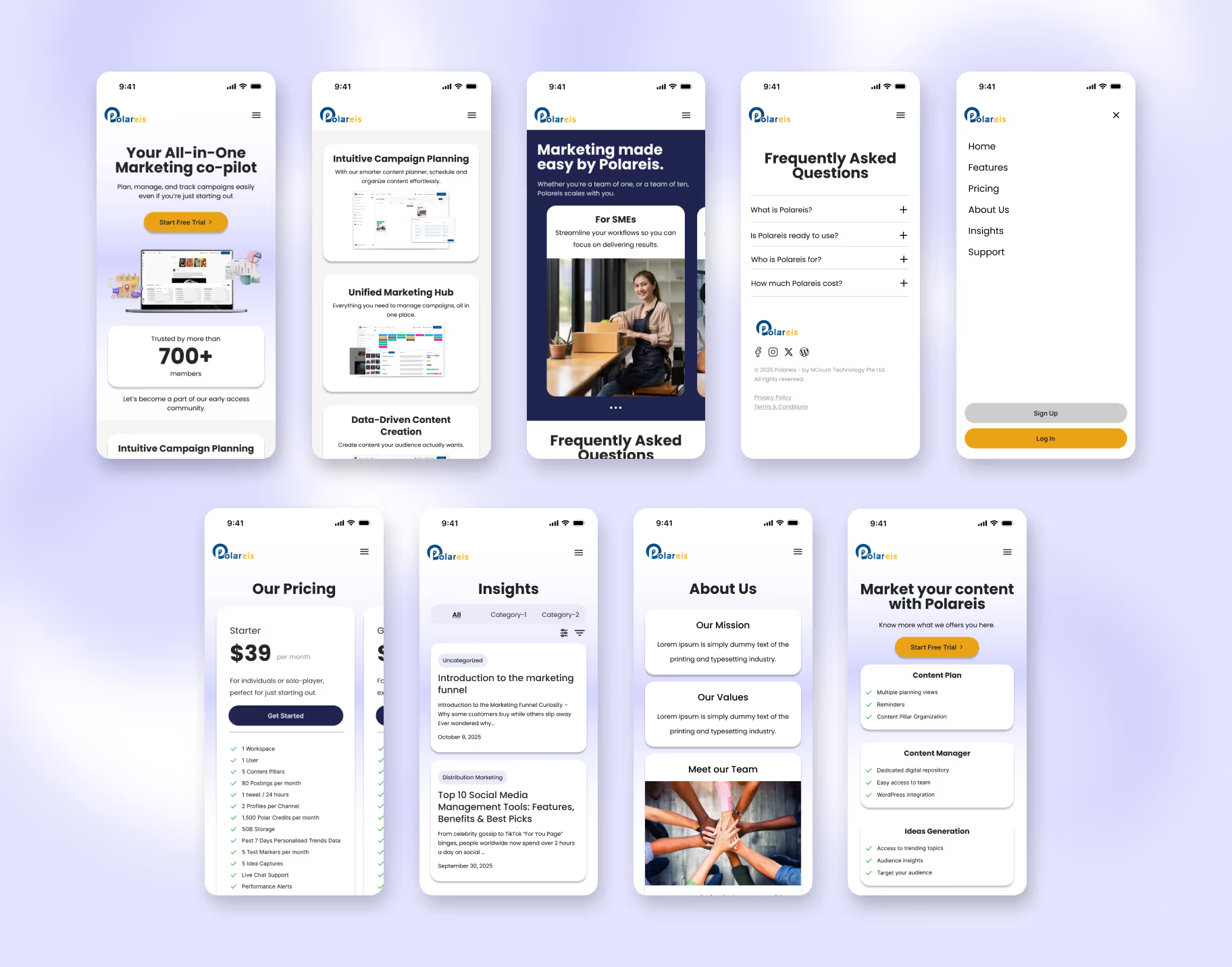
The image below shows the final design for all improved pages. Each redesign was guided by mobile usability, clarity of content, and consistent component use.
The first four screens represent the Home page. Polareis originally had a navigation bar that pushed page content downward when opened. I redesigned this into a full-screen modal menu, offering a cleaner, distraction-free mobile experience.
I switched to a horizontal slider layout for plan comparisons, replacing the original vertical stack. This lets users quickly scan differences and pick a suitable plan.
Added filter and sorting options to improve information discovery, enabling users to browse articles efficiently.
Both are new pages requested by Polareis. Using card-based layouts, I organized information into clear, digestible sections.
For the Features page, I refined their original buzzword-heavy copy into concise, UX-focused writing that better communicates value. Users can now scan for key information in seconds, supporting faster decision-making.

This project strengthened my ability to identify and resolve usability challenges through visual clarity and structured design thinking. I learned how small layout and content adjustments—like simplifying copy or refining spacing—can greatly improve comprehension and user flow.
Collaborating on this redesign also deepened my understanding of how design systems contribute to scalability and consistency. Moving forward, I plan to apply these principles to build more accessible and user-centered interfaces that balance both function and aesthetics.