
The Electronic Complaint System (ECS) is UTM’s internal mobile application used to manage campus maintenance tasks. It supports supervisors, facility managers, and vendors by streamlining complaint submissions, work order processing, and task tracking. This is also one of the mobile application I responsible for during my internship at UTMDigital.
I was assigned to improve the home dashboard UI after users reported confusion around the statistics and task summaries. The goal was to redesign the interface so supervisors and managers and vendors could immediately understand their workload and recent activities without navigating through multiple screens.
UI/UX Design · Frontend Development (Ionic Framework)
I redesigned the ECS homepage by focusing on clarity and usability:
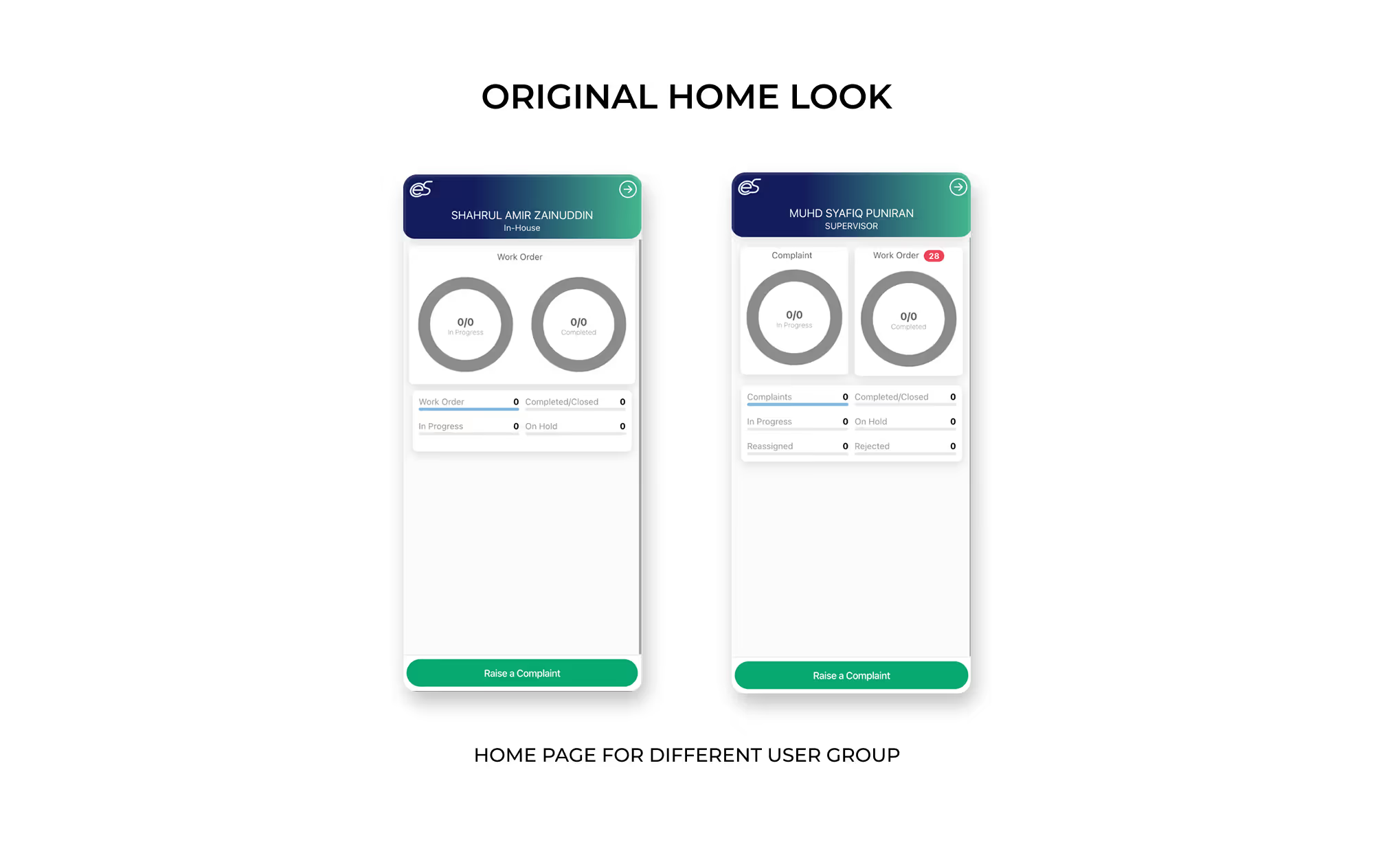
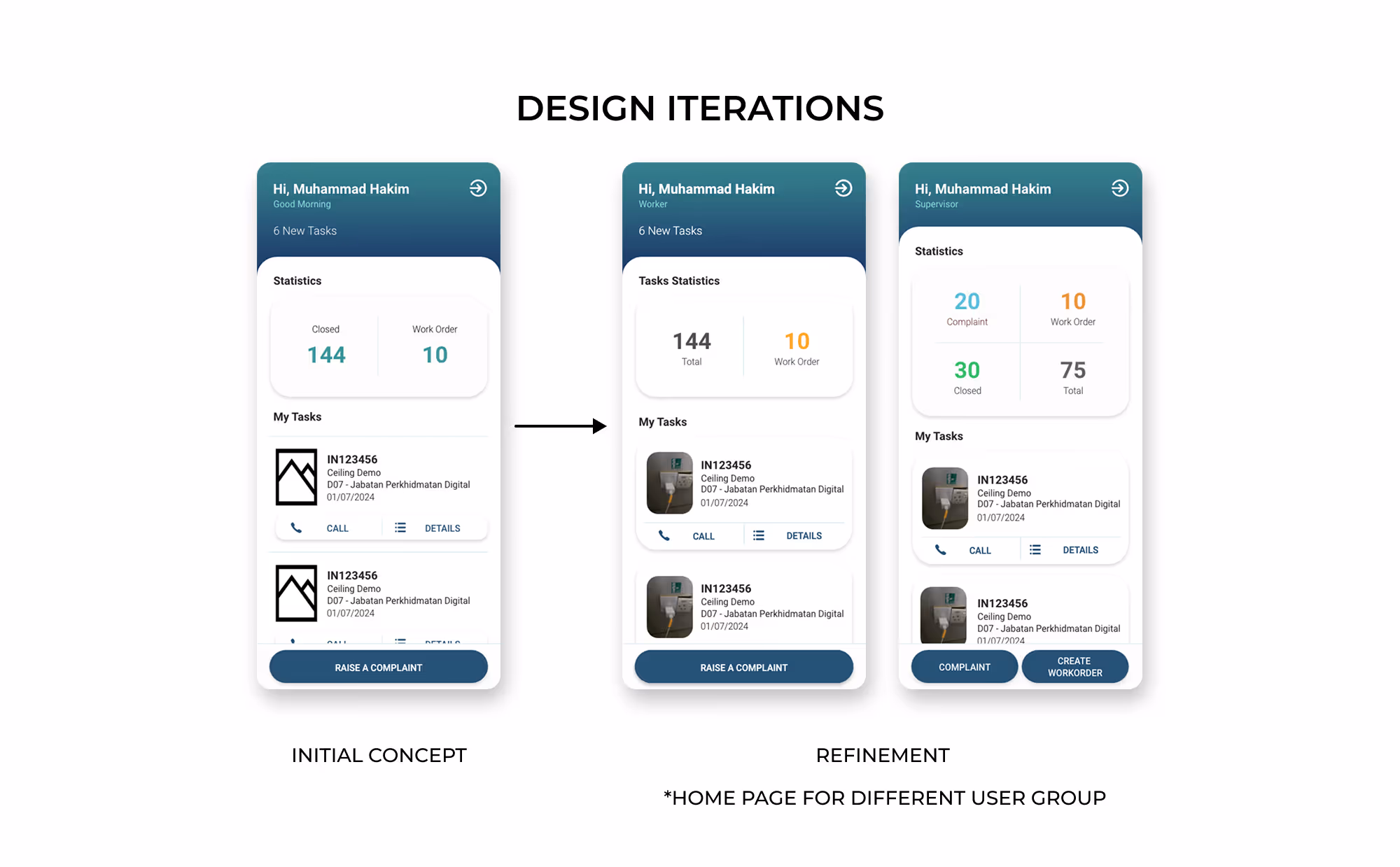
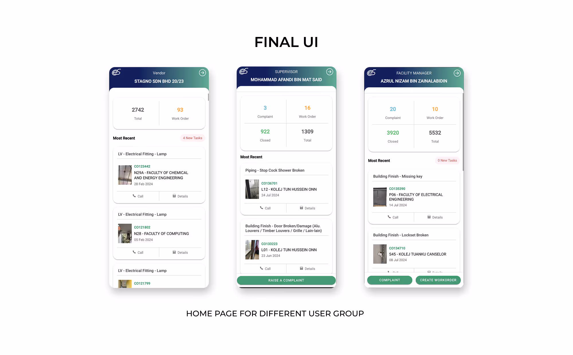
The image below shows the original dashboard UI, design improvement and final UI.
For this project, the client responded positively to the overall layout and content arrangement, noting that it feels much cleaner and more simplified compared to the original design.
Regarding the background color gradient, there were limited opportunities for change at the time. Since my work focused primarily on redesigning the homepage and assisting with minor debugging, the gradient remained as-is, which suited the project constraints.
Looking back, if given the chance to revisit the design, I would likely recommend moving away from the gradient in favor of a more modern background approach. Additionally, now that I am more aware of accessibility considerations, I would adjust the font colors used for displaying numerical data in the dashboard to improve readability for all users.
Although my internship ended before I could see the deployment, the redesign aimed to:
The new layout creates a more modern and efficient first-screen experience for daily maintenance operations.